Bose SoundTouch :: Design for an Integrated UX Ecosystem
The Challenge:
Build a design language, and direct design efforts, for a portfolio of interconnected music systems and the mobile app that controls and unifies them all.
The Process:
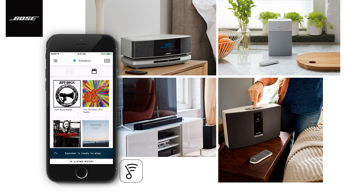
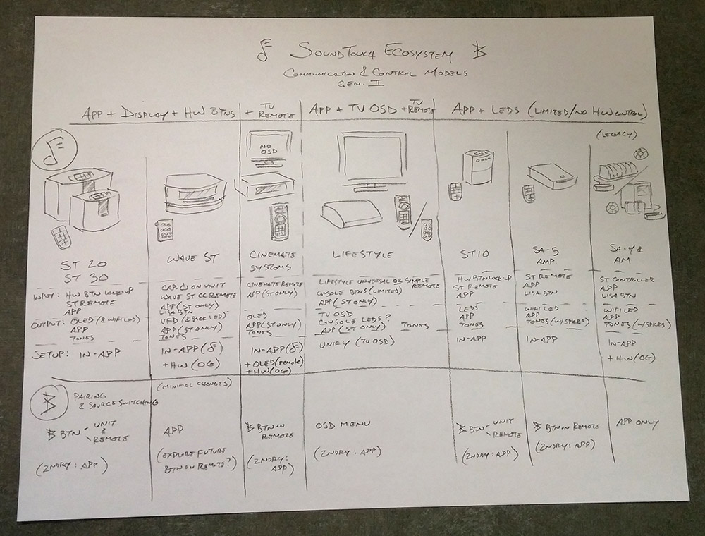
When I joined the User Experience team at Bose in early 2012, they had begun work on a portfolio of WiFi-connected Internet music products and services, and needed help to unify the experience its users would enjoy. We faced a diverse set of design challenges: hardware products, ecosystem behaviors, a mobile app as the control center, and integration of a number of music services and sources. It was critical that all of these pieces work together, and feel like they were designed together, to give our users a cohesive and amazing audio experience. I was charged with assembling a multi-functional team and creating a design language for interaction and visual design attributes that would be a red thread through all the above, and pull our current and future products and features together. Sketch of the second generation release of the SoundTouch ecosystem.
The Bose User:
Our consumer electronics users and their behaviors had been classified into a number of customer segments, but it became clear early on that not every segment was a relevant or primary Bose customer. Our core Bose customers--referred to as the Avid Enthusiasts and the Uncomplicated Enthusiasts--have a passion for performance and an appreciation for attention to detail, and differ in their attraction to either the most compelling new technology, or the most streamlined experience possible. Both appreciate elegance through simplicity. I promoted an approach to our work that focused on the primary Bose user in our core design, and accommodate second tier users and needs only where they wouldn't degrade the primary path.
The Tenets:
We began with the three core Bose principles:
Performance,
Elegance, and
Simplicity
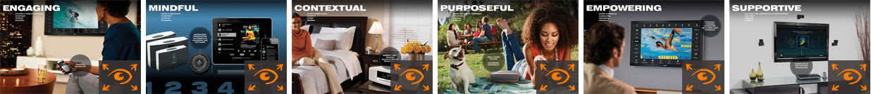
and I led a workshopping activity to translate those into design terms, from which my team distilled the tenets that would begin to functionally guide our day-to-day design choices. With the tenets to then guide us, I led development of, and wrote the guidelines for, a bible of interaction and visual design rules and practices for our entire design staff. Representation of each of the tenets from our Design Guidelines document.
Interaction Models:
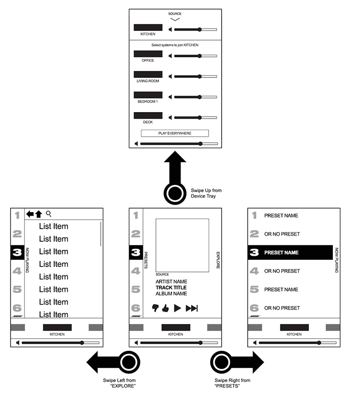
Our key competitor to the SoundTouch wireless music system was the Sonos portfolio. Comparisons were inevitable, but we focused our design effort on an understanding of our users and their needs. Leveraging our tenets, I championed a modal approach to the mobile app architecture that would satisfy our users' preference for clarity and simplicity, which stood in contrast to our competitor's design approach that put multiple control and function sets on a single app screen. In our case, more was less. Gestural navigation between primary app modes.
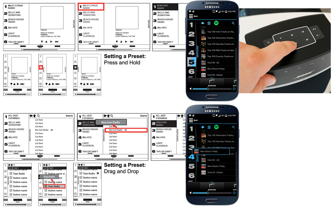
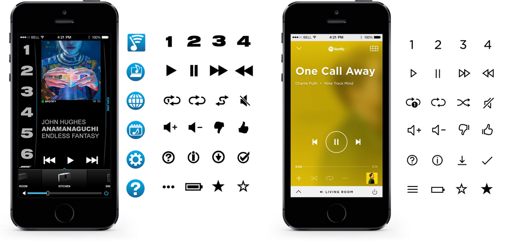
Consistency was also important to unify a broad portfolio. I developed with the team a set of interactions that could be universal between app and hardware, and from product to product, where users would benefit: setting a preset with a press-and-hold, visually communicating system status through OLEDs, LEDs, and icons, and in later products, pairing Bluetooth devices. We also took advantage of the unique capabilities of the touchpoints, adding things like gestural mode switching and source searching in the mobile app, responsive layout design to suit a world of mobile devices, audio system responses and voice prompts on speakers and headphones, and beyond. Common and unique interactions for setting presets.
Visual Design:
The user's content is the most important part of an audio experience. Music is emotional and full of memories and deep personal ties. I led the team to craft a visual design language that prioritizes the user's "content"--in this case, their music, collections and favorites--spatially, such as by featuring large album art on the core screen and giving ready access to their customized presets. The visual style took notes of Swiss design to create simple, clean, undistracting but clear controls and text, and a largely monochromatic color palette to be a stage to the user's content. We've taken the visual design through a number of evolutions since the initial release, but these principles have remained consistent. Visual design of mobile app at launch, and in 2016 redesign.
The Results:
Bose customers have appreciated our care for detail and attention to their unique preferences. I helped guide a number of research activities, both usability in-lab, and longitudinal and contextual in-field as part of a continuous evolution of design and design roadmaps. We have found that users love the simplicity of the hardware preset controls. They've resonated with improved product setup experiences our team has built, through design activities I've both led and participated in. The Bose UX Design Language has influenced over twenty product experiences and six mobile apps. The products have consistently received high marks--4+ stars in a majority of cases--from customers across ecommerce sites, and the app itself is at 4.5 stars at the time of this writing. The joys of being part of a passionate, excellence-obsessed UX team. Customer star ratings for the SoundTouch line at Bose.com as of 2016.